Show Mobile Navigation
Buttons and Icons
Showing posts with label Buttons and Icons. Show all posts

Add a Pro Download Button With Mouse Hover Effect

Hemant Verma - 8:09 PM

Buttons are very important for the blogger OR if you want to add a button which gives some downloading stuff then you can easily add this button and also It'll give a very professional look to your blog which is very important in today's day be'coz many visitors always think and feel about the professionalism of the blogger template and buttons and others stuff like widgets, buttons, plugins they always gives importance to the look of any template, which looks likes a professional.


Add a 3D Push-Pop Button in Blogger

Hemant Verma - 12:57 PM

Buttons and others effects are very important in blogging and specially when our blog related with designing and blogging blog that's why looks and feels are very important in the blog. From lasts post our team provided the buttons for live demo and for other stuffs like icons and other some stuff and so today we have a 3D Push-Pop button we can add in the blogger post and it's very unique kind of widget and it have a 3D look and easily customizable and has a Push - Pop effect when you click on the button.


Add Push-Pop Button in Blogger

  • Login to Blogger > Dashborad
  • Click on Drop Down Menu and select Template
  • Backup your Template before making any changes to your blog
  • Now Click on Edit HTML > Proceed > Expand Widget Templates
  • Press Ctrl + F and search the code shown below.

</head>

  • Paste below code before </head>


<link href='http://fonts.googleapis.com/css?family=Yanone+Kaffeesatz' rel='stylesheet' type='text/css'></link>

  • Now again find below code

]]></b:skin>


  • Paste below code before ]]></b:skin>

#wg-pushbutn a {
position: relative;
color: rgba(255,255,255,1);
text-decoration: none;
background-color: rgba(219,87,5,1);
font-family: 'Yanone Kaffeesatz';
font-weight: 700;
font-size: 30px;
display: block;
padding: 4px;
-webkit-border-radius: 8px;
-moz-border-radius: 8px;
border-radius: 8px;
-webkit-box-shadow: 0px 9px 0px rgba(219,31,5,1), 0px 9px 25px rgba(0,0,0,.7);
-moz-box-shadow: 0px 9px 0px rgba(219,31,5,1), 0px 9px 25px rgba(0,0,0,.7);
box-shadow: 0px 9px 0px rgba(219,31,5,1), 0px 9px 25px rgba(0,0,0,.7);
margin: 10px auto;
width: 200px;
text-align: center;
-webkit-transition: all .1s ease;
-moz-transition: all .1s ease;
-ms-transition: all .1s ease;
-o-transition: all .1s ease;
transition: all .1s ease;
}
#wg-pushbutn a:active {
-webkit-box-shadow: 0px 3px 0px rgba(219,31,5,1), 0px 3px 6px rgba(0,0,0,.9);
-moz-box-shadow: 0px 3px 0px rgba(219,31,5,1), 0px 3px 6px rgba(0,0,0,.9);
box-shadow: 0px 3px 0px rgba(219,31,5,1), 0px 3px 6px rgba(0,0,0,.9);
position: relative;
top: 6px;
}

  • Save Your Template.


How to Add it in Post....?

  • Go to posting area > HTML
  • Now paste code in it.

<div id="wg-pushbutn"><a href="#" target="_blank">Live Demo</a></div>


Make Changes...!

  • Replace # it with your link.
  • Replace Live Demo it with your own text.


    If Any Problem Comes, Ask in Comments


    Add a Pure Professional CSS Live Demo Button in Blogger

    Hemant Verma - 10:41 AM

    Buttons and Icons also very important for any blog be'coz they shows the specially of and good look of any blog, if your buttons is very good looking and give a feel of professionalism to any blog and if your buttons are good looking and different to others then it can be good for your blog. That's why our team introducing the new and pure CSS button for blogger. 


    Add Pure and Professional Button

    • Login to Blogger > Dashborad
    • Click on Drop Down Menu and select Template
    • Backup your Template before making any changes to your blog
    • Now Click on Edit HTML > Proceed > Expand Widget Templates
    • Press Ctrl + F and search the code shown below.

    </head>

    • Paste below code before </head>


    <link href='http://fonts.googleapis.com/css?family=Yanone+Kaffeesatz' rel='stylesheet' type='text/css'></link>

    • Now again find below code

    ]]></b:skin>


    • Paste below code before ]]></b:skin>


    #wg-dbutton {
    border:2px solid black;
    -moz-border-radius:6px;
    -webkit-border-radius:6px;
    background:#F8F8F8;
    box-shadow:3px 3px 3px #434343;
    width:130px;
    margin-bottom:5px;
    padding:5px;
    }

    #wg-dbutton a {
    color:#434343;
    background:#F8F8F8;
    display:inline-block;
    font-size:32px;
    font-family: 'Yanone Kaffeesatz';
    line-height:20px;
    text-decoration:none;
    -moz-border-radius:5px;
    -khtml-border-radius:5px;
    -webkit-border-radius:5px;
    border-radius:5px;
    padding:8px 14px;
    }

    #wg-dbutton a:hover {
    color:#fff;
    text-shadow:0 1px 0 #000;
    background:#434343;
    text-decoration:none;
    }

    • Save Your Template


      How to Add it in Post....?

      • Go to posting area > HTML
      • Now paste code in it.

      <div id="wg-dbutton"><a href="#" target="_blank"><b>Live Demo</b></a></div>


      Make Changes...!

      • Replace # it with your link.


      If Any Problem Comes, Ask in Comments


      Add a Orange Live Demo Button like Making Different

      Hemant Verma - 7:35 PM

      Making Different is very good and creative blog as we all know and the author and owner of that blog also is very creative and great blogger, and i think he love orange color :) be'coz he used orange colored theme in his blog but as he add a Live Demo button in this blog that is very good and my one of the reader ask for that. so today i'm presenting that Blogger Hack. Hope you will all like it.


      Add Orange Live Demo Button

      • Login to Blogger > Dashborad
      • Click on Drop Down Menu and select Template
      • Backup your Template before making any changes to your blog
      • Now Click on Edit HTML > Proceed > Expand Widget Templates
      • Press Ctrl + F and search the code shown below.

      ]]></b:skin>

      • Paste below code before ]]></b:skin>

      .wg-demobt a {margin-top:0px;margin-right: 10px;-moz-box-shadow:inset 0px 1px 0px 0px #ffffff;-webkit-box-shadow:inset 0px 1px 0px 0px #ffffff;box-shadow:inset 0px 1px 0px 0px #ffffff;/*-www.widgetgenerators.blogspot.com-*/background:-webkit-gradient( linear, left top, left bottom, color-stop(0.05, #f9780e), color-stop(1, #f9ead4) );background:-moz-linear-gradient( center top, #f9780e 5%, #f9ead4 100% );filter:progid:DXImageTransform.Microsoft.gradient(startColorstr='#f9780e', endColorstr='#f9ead4');/*-www.widgetgenerators.blogspot.com-*/background-color:#f9780e;-moz-border-radius:6px;
      -webkit-border-radius:6px;border-radius:6px;border:1px solid #f9780e;display:inline-block;color:#000000;font-family:arial;font-size:15px;font-weight:bold;padding:6px 24px;text-decoration:none;text-shadow:1px 1px 0px #ffffff;}.wg-demobt a:hover{background:-webkit-gradient( linear, left top, left bottom, color-stop(0.05, #f9ead4), color-stop(1, #f9780e) );background:-moz-linear-gradient( center top, #f9ead4 5%, #f9780e 100% );filter:progid:DXImageTransform.Microsoft.gradient(startColorstr='#f9ead4', endColorstr='#f9780e');background-color:#f9ead4;}.wg-demobt a:active {position:relative;top:1px;}

      • Save your template.


      How to add it in post....?

      • Go to posting area > HTML
      • Now paste code in it.

      <div class="wg-demobt">
      <a href="#">Live Demo</a>
      </div>


      Make Changes....!

      • Replace # with your link.
      • You can replace Live Demo with your own text. (Optional)


      If Any Problem Comes, Ask in Comments


      Add a Simple 3D Button in Blogger

      Hemant Verma - 9:23 PM


      3D basic button for Blogger you can easily use it for any kind of purpose like for some special notification in your post OR for live demo OR for new kind of special text OR also can use it for intention. It's simply made by using the HTML codes. 


      Importance....!

      • This is specially made by the HTML codes.
      • It can give a very good effect on the appearance of your blog.
      • It seems like a 3D Button.
      • Very Important for the look wise.


        Add 3D Button

        • Login to Blogger > Dashboard
        • Go to Posting > Edit HTML
        • Paste below codes in Edit HTML area where you write your post.

        <center>
        <br/>
        <span style="border-color: rgb(11, 83, 148) rgb(72, 161, 250); border-style: solid; border-width: 10px; padding: 6px;"><b><span style="color: #289728; font-family: Verdana,sans-serif;"><span style="font-size: large;"><span style="color: blue;"><span style="font-size: small;">Write Your Text Here</b></div>
        </center>


        Make Changes....!


        • Replace Write Your Text Here it with your own text.


          This is Live Demo 


          If Any Problem Comes, Ask in Comments


          New Professional Shining Download Buttons for Blogger

          Hemant Verma - 5:37 PM

          Collection of Professional Shining Buttons with three different categories like Beveled Buttons, Chrome Butttons, Flat Buttons, Glass Buttons with a new Glossy and HD feel which is totally look like a Professional Look.


          It has total 50 different buttons 

          Its time to get rid of the Download Text and replace it with a cool, stylish, professional and most importantly with an animated Shining HD Button. With four different styles and versions in it.


          Download


          If Any Problem Comes, Ask in Comments


          Rose Bottle Social Sharing Icons

          Hemant Verma - 6:46 PM

          Hurry!  Download Free

          Pro Rose Bottle Social Sharing Icons for Blogger


          Download


          The Icons are compressed in png format. The zip file contains two sets of icons, one is small Rose Bottles Icon and other is Big Rose Bottle Icons. This set of Widget Generators Icons consists of 6 x 2 = 12 icons which includes Facebook, Twitter, Picasa ,  Digg, E-Mail Upon and RSS (which of Course isn’t a social media icon, just added it for fun),

          We have created some more Social Bookmarking Icons as well and will release them soon.  Till then let us know how will you rank our icons.


          All The Best,

          Regards,
          Widget Generators

          Add Animated CSS3 Bubble Buttons for Blogger

          Hemant Verma - 6:27 PM

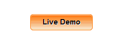
          These animated and fully professional bubble buttons are made with pure CSS3 and on mouse hover the bubble star shaking and this effect makes these button more beautiful.This button is available in four color themes and three sizes so that you can add any button of any size just by just changing the class name of button.


          Add Animated CSS3 Bubble Buttons for Blogger

          • Login to Blogger > Dashborad
          • Click on Drop Down Menu and select Template
          • Backup your Template before making any changes to your blog
          • Now Click on Edit HTML > Proceed > Expand Widget Templates
          • Press Ctrl + F and search the code shown below.

          ]]></b:skin>

          • Paste below code before ]]></b:skin>

          .button {
          font:15px Calibri, Arial, sans-serif;
          text-shadow:1px 1px 0 rgba(255,255,255,0.4);
          text-decoration:none!important;
          white-space:nowrap;
          display:inline-block;
          vertical-align:baseline;
          position:relative;
          cursor:pointer;
          background-repeat:no-repeat;
          background-image:url(https://blogger.googleusercontent.com/img/b/R29vZ2xl/AVvXsEg5iKj-Qd_xWbeFNVobwBjfVdO7Sy4Ns2UnDDRxEWFvBlE4Cg8nc_w_Xfxo0iRTaHSaLRr93Jno0XyyUSSVjy46fmC4hZ2ZBIQ5JiJxhyCC6YSO7CYkYXWADXCNnEwH0USSjNVNDJ52qsvq/s1600/widgetgenerators.blogspot.com-button_bg.png);
          background-position:bottom left, top right, 0 0 0 0;
          background-clip:border-box;
          -moz-border-radius:8px;
          -webkit-border-radius:8px;
          border-radius:8px;
          -moz-box-shadow:0 0 1px #fff inset;
          -webkit-box-shadow:0 0 1px #fff inset;
          box-shadow:0 0 1px #fff inset;
          -webkit-transition:background-position 1s;
          -moz-transition:background-position 1s;
          transition:background-position 1s;
          padding:10px 20px;
          }

          .button:hover {
          background-position:top left, bottom right, 0 0 0 0;
          }

          .button:active {
          bottom:-1px;
          }

          .button.big {
          font-size:30px;
          }

          .button.medium {
          font-size:18px;
          }

          .button.small {
          font-size:13px;
          }

          .button.rounded {
          -moz-border-radius:4em;
          -webkit-border-radius:4em;
          border-radius:4em;
          }

          .blue.button {
          color:#0f4b6d!important;
          border:1px solid #84acc3!important;
          background-color:#48b5f2;
          background-image:url(https://blogger.googleusercontent.com/img/b/R29vZ2xl/AVvXsEg5iKj-Qd_xWbeFNVobwBjfVdO7Sy4Ns2UnDDRxEWFvBlE4Cg8nc_w_Xfxo0iRTaHSaLRr93Jno0XyyUSSVjy46fmC4hZ2ZBIQ5JiJxhyCC6YSO7CYkYXWADXCNnEwH0USSjNVNDJ52qsvq/s1600/widgetgenerators.blogspot.com-button_bg.png), url(https://blogger.googleusercontent.com/img/b/R29vZ2xl/AVvXsEg5iKj-Qd_xWbeFNVobwBjfVdO7Sy4Ns2UnDDRxEWFvBlE4Cg8nc_w_Xfxo0iRTaHSaLRr93Jno0XyyUSSVjy46fmC4hZ2ZBIQ5JiJxhyCC6YSO7CYkYXWADXCNnEwH0USSjNVNDJ52qsvq/s1600/widgetgenerators.blogspot.com-button_bg.png), 0 to(rgba(89,208,244,0))), 0 to(#3faeeb));
          }

          .blue.button:hover {
          background-color:#63c7fe;
          background-image:url(https://blogger.googleusercontent.com/img/b/R29vZ2xl/AVvXsEg5iKj-Qd_xWbeFNVobwBjfVdO7Sy4Ns2UnDDRxEWFvBlE4Cg8nc_w_Xfxo0iRTaHSaLRr93Jno0XyyUSSVjy46fmC4hZ2ZBIQ5JiJxhyCC6YSO7CYkYXWADXCNnEwH0USSjNVNDJ52qsvq/s1600/widgetgenerators.blogspot.com-button_bg.png), url(https://blogger.googleusercontent.com/img/b/R29vZ2xl/AVvXsEg5iKj-Qd_xWbeFNVobwBjfVdO7Sy4Ns2UnDDRxEWFvBlE4Cg8nc_w_Xfxo0iRTaHSaLRr93Jno0XyyUSSVjy46fmC4hZ2ZBIQ5JiJxhyCC6YSO7CYkYXWADXCNnEwH0USSjNVNDJ52qsvq/s1600/widgetgenerators.blogspot.com-button_bg.png), 0 to(rgba(109,217,250,0))), 0 to(#58bef7));
          }

          .green.button {
          color:#345903!important;
          border:1px solid #96a37b!important;
          background-color:#79be1e;
          background-image:url(https://blogger.googleusercontent.com/img/b/R29vZ2xl/AVvXsEg5iKj-Qd_xWbeFNVobwBjfVdO7Sy4Ns2UnDDRxEWFvBlE4Cg8nc_w_Xfxo0iRTaHSaLRr93Jno0XyyUSSVjy46fmC4hZ2ZBIQ5JiJxhyCC6YSO7CYkYXWADXCNnEwH0USSjNVNDJ52qsvq/s1600/widgetgenerators.blogspot.com-button_bg.png), url(https://blogger.googleusercontent.com/img/b/R29vZ2xl/AVvXsEg5iKj-Qd_xWbeFNVobwBjfVdO7Sy4Ns2UnDDRxEWFvBlE4Cg8nc_w_Xfxo0iRTaHSaLRr93Jno0XyyUSSVjy46fmC4hZ2ZBIQ5JiJxhyCC6YSO7CYkYXWADXCNnEwH0USSjNVNDJ52qsvq/s1600/widgetgenerators.blogspot.com-button_bg.png), 0 to(rgba(162,211,30,0))),-webkit-gradient(linear,0%0%,0%100%,from(#82cc27), to(#74b317));
          }

          .green.button:hover {
          background-color:#89d228;
          background-image:url(https://blogger.googleusercontent.com/img/b/R29vZ2xl/AVvXsEg5iKj-Qd_xWbeFNVobwBjfVdO7Sy4Ns2UnDDRxEWFvBlE4Cg8nc_w_Xfxo0iRTaHSaLRr93Jno0XyyUSSVjy46fmC4hZ2ZBIQ5JiJxhyCC6YSO7CYkYXWADXCNnEwH0USSjNVNDJ52qsvq/s1600/widgetgenerators.blogspot.com-button_bg.png), url(https://blogger.googleusercontent.com/img/b/R29vZ2xl/AVvXsEg5iKj-Qd_xWbeFNVobwBjfVdO7Sy4Ns2UnDDRxEWFvBlE4Cg8nc_w_Xfxo0iRTaHSaLRr93Jno0XyyUSSVjy46fmC4hZ2ZBIQ5JiJxhyCC6YSO7CYkYXWADXCNnEwH0USSjNVNDJ52qsvq/s1600/widgetgenerators.blogspot.com-button_bg.png), 0 to(rgba(183,229,45,0))),-webkit-gradient(linear,0%0%,0%100%,from(#90de31), to(#7fc01e));
          }

          .orange.button {
          color:#693e0a!important;
          border:1px solid #bea280!important;
          background-color:#e38d27;
          background-image:url(https://blogger.googleusercontent.com/img/b/R29vZ2xl/AVvXsEg5iKj-Qd_xWbeFNVobwBjfVdO7Sy4Ns2UnDDRxEWFvBlE4Cg8nc_w_Xfxo0iRTaHSaLRr93Jno0XyyUSSVjy46fmC4hZ2ZBIQ5JiJxhyCC6YSO7CYkYXWADXCNnEwH0USSjNVNDJ52qsvq/s1600/widgetgenerators.blogspot.com-button_bg.png), url(https://blogger.googleusercontent.com/img/b/R29vZ2xl/AVvXsEg5iKj-Qd_xWbeFNVobwBjfVdO7Sy4Ns2UnDDRxEWFvBlE4Cg8nc_w_Xfxo0iRTaHSaLRr93Jno0XyyUSSVjy46fmC4hZ2ZBIQ5JiJxhyCC6YSO7CYkYXWADXCNnEwH0USSjNVNDJ52qsvq/s1600/widgetgenerators.blogspot.com-button_bg.png), 0 to(rgba(232,189,45,0))),-webkit-gradient(linear,0%0%,0%100%,from(#f1982f), to(#d4821f));
          }

          .orange.button:hover {
          background-color:#ec9732;
          background-image:url(https://blogger.googleusercontent.com/img/b/R29vZ2xl/AVvXsEg5iKj-Qd_xWbeFNVobwBjfVdO7Sy4Ns2UnDDRxEWFvBlE4Cg8nc_w_Xfxo0iRTaHSaLRr93Jno0XyyUSSVjy46fmC4hZ2ZBIQ5JiJxhyCC6YSO7CYkYXWADXCNnEwH0USSjNVNDJ52qsvq/s1600/widgetgenerators.blogspot.com-button_bg.png), url(https://blogger.googleusercontent.com/img/b/R29vZ2xl/AVvXsEg5iKj-Qd_xWbeFNVobwBjfVdO7Sy4Ns2UnDDRxEWFvBlE4Cg8nc_w_Xfxo0iRTaHSaLRr93Jno0XyyUSSVjy46fmC4hZ2ZBIQ5JiJxhyCC6YSO7CYkYXWADXCNnEwH0USSjNVNDJ52qsvq/s1600/widgetgenerators.blogspot.com-button_bg.png), 0 to(rgba(241,192,52,0))),-webkit-gradient(linear,0%0%,0%100%,from(#f9a746), to(#e18f2b));
          }

          .gray.button {
          color:#525252!important;
          border:1px solid #a5a5a5!important;
          background-color:#a9adb1;
          background-image:url(https://blogger.googleusercontent.com/img/b/R29vZ2xl/AVvXsEg5iKj-Qd_xWbeFNVobwBjfVdO7Sy4Ns2UnDDRxEWFvBlE4Cg8nc_w_Xfxo0iRTaHSaLRr93Jno0XyyUSSVjy46fmC4hZ2ZBIQ5JiJxhyCC6YSO7CYkYXWADXCNnEwH0USSjNVNDJ52qsvq/s1600/widgetgenerators.blogspot.com-button_bg.png), url(https://blogger.googleusercontent.com/img/b/R29vZ2xl/AVvXsEg5iKj-Qd_xWbeFNVobwBjfVdO7Sy4Ns2UnDDRxEWFvBlE4Cg8nc_w_Xfxo0iRTaHSaLRr93Jno0XyyUSSVjy46fmC4hZ2ZBIQ5JiJxhyCC6YSO7CYkYXWADXCNnEwH0USSjNVNDJ52qsvq/s1600/widgetgenerators.blogspot.com-button_bg.png), 0 to(rgba(197,199,202,0))),-webkit-gradient(linear,0%0%,0%100%,from(#c5c7ca), to(#92989c));
          }

          .gray.button:hover {
          background-color:#b6bbc0;
          background-image:url(https://blogger.googleusercontent.com/img/b/R29vZ2xl/AVvXsEg5iKj-Qd_xWbeFNVobwBjfVdO7Sy4Ns2UnDDRxEWFvBlE4Cg8nc_w_Xfxo0iRTaHSaLRr93Jno0XyyUSSVjy46fmC4hZ2ZBIQ5JiJxhyCC6YSO7CYkYXWADXCNnEwH0USSjNVNDJ52qsvq/s1600/widgetgenerators.blogspot.com-button_bg.png), url(https://blogger.googleusercontent.com/img/b/R29vZ2xl/AVvXsEg5iKj-Qd_xWbeFNVobwBjfVdO7Sy4Ns2UnDDRxEWFvBlE4Cg8nc_w_Xfxo0iRTaHSaLRr93Jno0XyyUSSVjy46fmC4hZ2ZBIQ5JiJxhyCC6YSO7CYkYXWADXCNnEwH0USSjNVNDJ52qsvq/s1600/widgetgenerators.blogspot.com-button_bg.png), 0 to(rgba(202,205,208,0))),-webkit-gradient(linear,0%0%,0%100%,from(#d1d3d6), to(#9fa5a9));
          }

          • Save Your template.


          How to Add buttons in post


          1.HTML For Big Button (Choose anyone according to button color)

              <a href="#" class="button big blue">TEXT HERE</a>


              <a href="#" class="button big green">TEXT HERE</a>


              <a href="#" class="button big orange">TEXT HERE</a>


              <a href="#" class="button big gray">TEXT HERE</a>


          2.HTML For Medium Button (Choose anyone according to button color)

              <a href="#" class="button blue medium">TEXT HERE</a>


              <a href="#" class="button green medium">TEXT HERE</a>


              <a href="#" class="button orange medium">TEXT HERE</a>


              <a href="#" class="button gray medium">TEXT HERE</a>


          3.HTML For Small Button (Choose anyone according to button color)

              <a href="#" class="button small blue">TEXT HERE</a>


              <a href="#" class="button small green">TEXT HERE</a>


              <a href="#" class="button small orange">TEXT HERE</a>


              <a href="#" class="button small gray">TEXT HERE</a>


          4.HTML For Small Rounded Buttons (Choose anyone according to button color)

              <a href="#" class="button small blue rounded">TEXT HERE</a>


              <a href="#" class="button small green rounded">TEXT HERE</a>


              <a href="#" class="button small orange rounded">TEXT HERE</a>


              <a href="#" class="button small gray rounded">TEXT HERE</a>


           Make Changes....!!!!

          • Replace # from link.
          • Replace TEXT HERE from text.


          If Any Problem Comes, Ask in Comments


          Previous
          Editor's Choice


          Make Your Blog Like a Pro
          About | Contact | Affiliates | Privacy Policy | TOS